
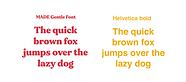
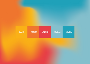
This has been my biggest digital project yet. For my college interviews, I wore my portfolio and I wanted to do something different this time around as well, it couldn’t be just another pdf. This project is a reflection of who I am as a person. The tone used for the website is personal and fun. The colour palette I’ve picked is also along the same theme. The main menu options are WHO, WHAT, WHY and WORK, was inspired by the creative writing exercise of who, what, why, how as a way to cover all bases when you write a story. This was a way to also cover all the bases when I present myself and my work.
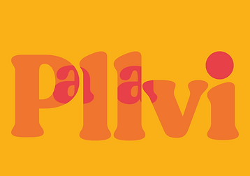
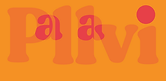
The large font Pallavi icon is redirects to the home page.
What most interested me during this project was coming up with a logo for my name, I felt my name was too long so I shortened without actually having to do that by placing differently coloured a’s within the rest of my name. I also wanted non-functional features as a part of my website to make it more interactive and fun; so I modified the website cookies pop-up with something that hopefully makes you smile.